
Color spaces play a crucial role in photography—they affect every image you capture in one way or another. The most common color spaces you’ll encounter are sRGB, Adobe RGB, and ProPhoto RGB. But why are they so important?
There’s a lot of conflicting information out there, including outdated advice and misleading claims. Still, if you’re willing to learn, there’s also a wealth of accurate, useful guidance. This article will introduce you to sRGB, Adobe RGB, and ProPhoto RGB—and help you understand when and why to use each one.
1. What are sRGB, Adobe RGB, and ProPhoto RGB?
sRGB, Adobe RGB, and ProPhoto RGB are three of the most widely used color spaces in photography.
A “color space” isn’t some overly technical or intimidating concept—it simply refers to a specific range of colors, like a container that holds all the possible hues and tones available for use. Think of it this way: if you had only two paint colors—red and blue—and a white canvas, your color space would be limited to the combinations you can make from those two paints, including lighter versions where the white canvas shows through.
A helpful way to picture a color space is to imagine all the colors that the human eye can perceive. If a color isn’t visible to us, it might as well not exist—because color, at its core, is a perception. You may have seen visual representations of this concept before (f1) that map out the full spectrum of visible colors and show how much of that spectrum a given color space can capture.
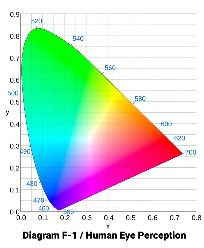 The diagram F-1, represents the full range of colors the human eye can see. Keep in mind, though, it’s a two-dimensional representation—showing only the chromaticity (the x and y axes). It doesn’t include brightness or luminance, so darker colors aren’t fully depicted here.
So, where do sRGB, Adobe RGB, and ProPhoto RGB fit into this picture? Each of these color spaces outlines a specific portion of that visible range. They essentially “overlay” the diagram, defining which colors can be represented within each space. In fact, ProPhoto RGB even extends beyond the visible spectrum in some areas.
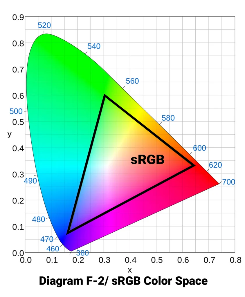
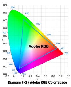
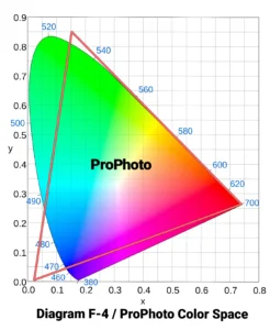
The shapes you’ll see in the comparison diagrams below illustrate how much of the visible color spectrum each color space covers. If you’re just starting to explore this topic, these visuals might already help clarify some of your questions.
And here’s how they all look overlaid together (F-5):
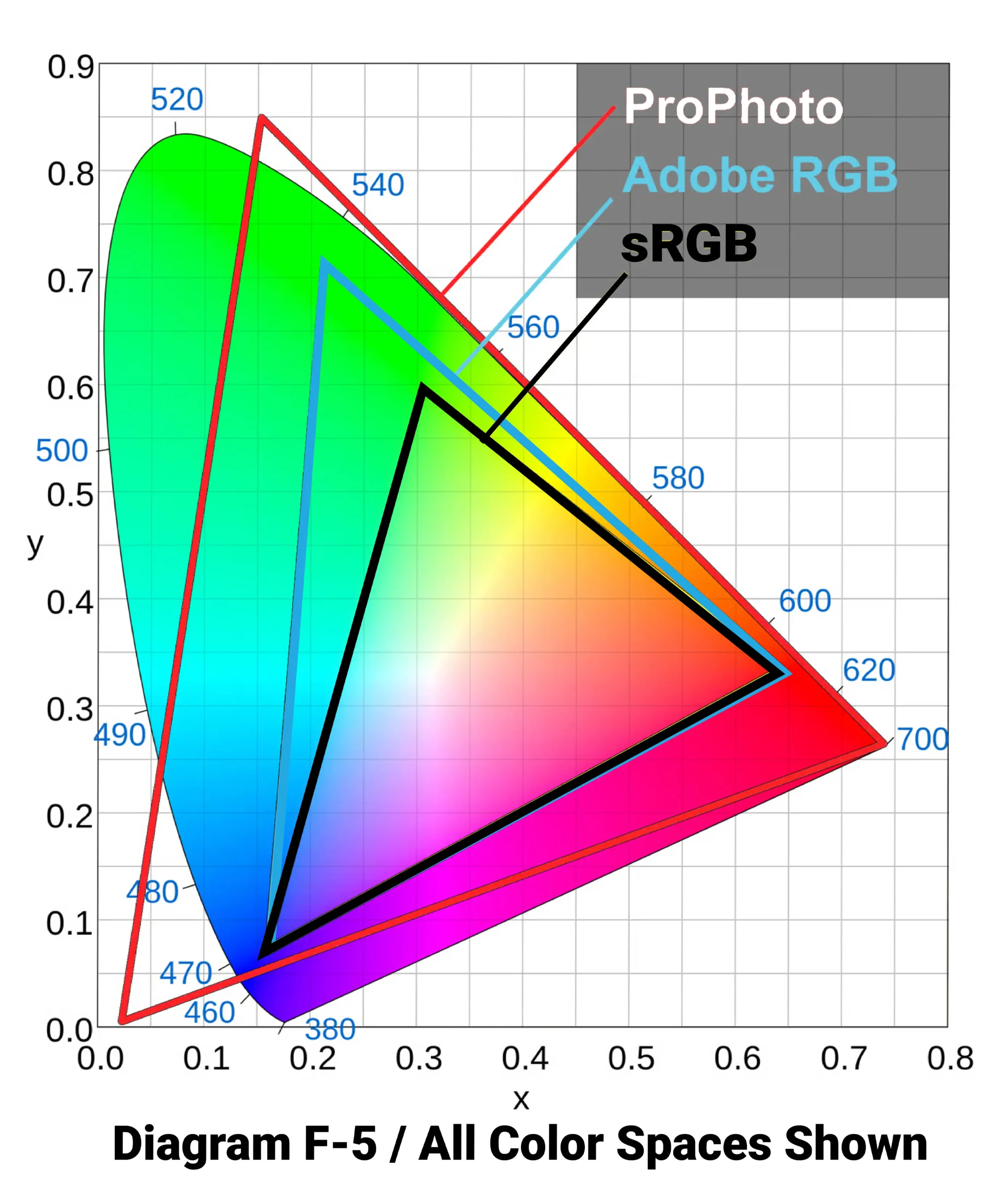
As you can see, sRGB is the smallest of the three-color spaces. Its gamut—meaning its range of reproducible colors—covers only a limited portion of what the human eye can perceive. Adobe RGB expands on that, especially in the green and cyan areas, allowing for more saturated colors (also known as greater chroma) in those regions.
ProPhoto RGB is the largest color space of the three—and arguably the most intriguing. It actually includes “colors” that fall outside the range of human vision. These are sometimes referred to as imaginary colors—not because they’re magical, but because our eyes simply can’t perceive them. While they aren’t directly useful for display, their inclusion allows ProPhoto RGB to encompass a broader range of real, visible colors than either sRGB or Adobe RGB.
2. Understanding RGB Values
Let’s say you want to define a specific color—maybe a soft shade of beige-white. Color spaces are built on mathematical models, meaning every color has a precise set of “coordinates” within a given color space. These coordinates vary depending on the space you’re working in. In other words, the same RGB values can produce completely different colors depending on the color space.
“RGB” stands for Red, Green, and Blue—the three channels used to create all colors in a digital image. Each channel has a value, and together they define a specific color. For example, in the sRGB color space, the beige-white color in question might be represented as RGB (255, 248, 231)—meaning the red channel is set to 255, green to 248, and blue to 231.
However, if you use those exact same values—255, 248, 231—in Adobe RGB or ProPhoto RGB, the resulting color will be different. This is a critical point: RGB values are relative to the color space. Without knowing the color space, an RGB value is meaningless. That’s why every photo needs to include metadata specifying which color space it’s using.
Unfortunately, not all software reads this metadata correctly. Some applications will ignore the embedded color space and assume a default—usually sRGB. That leads to inaccurate color display, because the software is interpreting the RGB values incorrectly. For example, the same RGB value like (120, 140, 160) will look noticeably different in sRGB versus ProPhoto, and treating them as equivalent can ruin color accuracy.
3. Understanding Bit Depth
Another key concept in digital color is bit depth (also called color depth)—the amount of data used to describe each pixel’s color.
In photography, the standard is usually 8 bits per channel. This gives each color channel (red, green, and blue) 256 possible values, from 0 to 255. Combined, this results in:
256 × 256 × 256 = 16,777,216 possible RGB combinations.
That’s over 16 million colors—plenty for most uses. However, for more advanced editing and smoother results, many photographers work with 16-bit per channel images. This expands the total number of possible RGB combinations to over 281 trillion.
That may seem excessive—especially considering the human eye can only distinguish a small fraction of those—but using 16-bit color has practical benefits. It allows for extremely smooth gradients, which helps prevent banding, where subtle transitions between colors appear as harsh, visible steps.
Important note: Not all of those trillions of RGB combinations are perceivable as unique colors. Many are indistinguishable to the human eye. And in larger color spaces like ProPhoto, some combinations correspond to “imaginary” colors that don’t even exist in visible reality—they’re just mathematical placeholders.
3.1. Do Larger Color Spaces Contain More Colors?
One common misconception is that larger color spaces, like ProPhoto RGB, contain more colors than smaller ones like sRGB.
That’s not quite true. The number of colors in an image depends on its bit depth, not the size of the color space. An 8-bit photo in ProPhoto RGB contains the same number of color values—about 16.8 million—as an 8-bit photo in sRGB. The difference is that those colors are spread across a larger range in ProPhoto.
This can actually introduce problems, especially when working with low bit depths in large color spaces.
3.2. Bit Depth and Banding
The larger the color space, the more critical it becomes to work at a higher bit depth.
In sRGB and Adobe RGB, 8-bit color usually provides smooth transitions between tones, with little to no visible banding. But if you use those same 8-bit values in ProPhoto RGB, they’re spaced much farther apart across the larger color range. That increases the risk of visible banding—especially in smooth gradients like skies or skin tones.
To avoid this, it’s recommended to use 16-bit per channel color when working in wide-gamut spaces like Adobe RGB or ProPhoto RGB. This ensures smoother transitions and gives you more flexibility when editing, reducing the risk of introducing artifacts or color stepping in your final image.
You can work around this easily by avoiding 8-bit color with ProPhoto images.
4. Working Space vs. Output Space
There are two key points in a photographer’s workflow where choosing a color space matters: during post-processingand at the final output stage.
If you’re shooting JPEG (not recommended), your camera may already prompt you to choose between sRGB and Adobe RGB. However, for RAW shooters, this setting doesn’t affect the image data itself—only the in-camera preview. If you want a slightly more accurate preview, selecting Adobe RGB can help, but it won’t impact the RAW file in any meaningful way.
Let’s break down why color space choice matters for both post-processing and output.
4.1. Working Space
Your working space is the color space your editing software uses while processing an image. All edits, adjustments, and color data remain confined to this space. If you edit a photo in sRGB working space, any colors that fall outside of sRGB will be clipped, even if your original RAW file contains them.
This is why using ProPhoto RGB as your working space is ideal—especially when editing RAW files. RAW images often include colors beyond both sRGB and Adobe RGB, particularly in highly saturated or shadow areas. Choosing ProPhoto preserves those colors during editing.
In applications like Adobe Lightroom or Camera Raw, ProPhoto is already the default internal color space for RAW processing. But the transition to Photoshop can be a weak link if you’re not careful. If your external editing preferences are set to sRGB or Adobe RGB, you’ll be discarding color information unnecessarily.
To ensure you maintain the widest color fidelity:
In Lightroom, go to Preferences > External Editing, set:
File Format: TIFF
Color Space: ProPhoto RGB
Bit Depth: 16 bits/component
In Camera Raw, click the blue link at the bottom of the screen and set:
Color Space: ProPhoto RGB
Bit Depth: 16-bit
In Photoshop, go to Edit > Color Settings, and set:
RGB: Leave the working space as ProPhoto RGB or simply choose “Preserve Embedded Profiles.”
Enable warnings for profile mismatches so you’re notified when an image’s embedded profile doesn’t match your working space.
Important: If you’ve just realized you’ve been editing in sRGB or Adobe RGB until now, switching to ProPhoto RGB is a step in the right direction—but it comes with responsibility. When exporting images for the web, you must convert them back to sRGB or best Adobe RGB. Otherwise, colors may look flat or incorrect on non-color-managed devices.
In Photoshop, simply go to Edit > Convert to Profile and select sRGB IEC61966-2.1 before exporting for online use.
4.2. Output Space
Your output space is the color space assigned to the final version of your photo—whether it’s for web, print, or handoff to a client or another editor.
Different outputs require different considerations:
For Web Use:
Use sRGB. Most monitors and browsers are not color-managed and expect sRGB. ProPhoto or Adobe RGB images will often appear washed out or low contrast on the web.
For Print:
It’s best to retain the largest working space—typically ProPhoto RGB—and convert to your printer’s ICC profile during soft proofing or export. This ensures the printer receives the most accurate color information possible. We use Adobe RGB for your final color space mode.
For Collaboration:
If handing off files to another photographer or retoucher, ProPhoto (with embedded profile) is usually safest. But always confirm what color space the recipient expects.
5. When Should You Use sRGB, Adobe RGB, and ProPhoto RGB?
Each of these color spaces serves a purpose. Here’s when to use each:
5.1. sRGB – The Default for a Reason
sRGB is often called the “default” color space, and with good reason. It’s the most widely supported and offers the best compatibility across devices and platforms.
✅ Use sRGB for:
Web publishing (websites, social media, online portfolios)
Sending photos to clients who will view them on standard monitors
Submitting images to labs or services that only support sRGB
That said, sRGB should not be your working space during post-processing. Its limited gamut means you’ll clip color data before you even have the chance to use it.
So why does sRGB matter so much for final output?
Because not all applications are color managed. Many will ignore the color profile embedded in an image and instead interpret colors based on your monitor’s color space—which is often close to sRGB. This means that exporting your final photo in Adobe RGB of sRGB gives you the best chance of consistent color display across platforms and devices.
⚠️ A ProPhoto image viewed in a non-color-managed browser or app will often appear dull, desaturated, or just “off.” This is why converting to sRGB or Adobe RGB before sharing is critical.
5.2. ProPhoto RGB – The Ideal Working Space
Let’s revisit ProPhoto RGB—which is, in most cases, the best choice for your working and editing space, not your output space.
This is why Lightroom and Camera Raw use a ProPhoto-relative color space under the hood. When editing in ProPhoto, you preserve more of the original data from your RAW files, particularly in saturated tones and shadow details. Even if your output will eventually be in a smaller color space like sRGB, starting with ProPhoto gives you more flexibility and control before compressing color data.
But there’s a caveat: never export or publish photos in ProPhoto RGB unless you know the recipient is using fully color-managed software. A ProPhoto image viewed in a non-color-managed application—like many web browsers, email clients, or default photo viewers—will appear washed out, flat, and inaccurate.
⚠️ Pro tip: If you work with clients, accidentally delivering ProPhoto RGB images can backfire. If they open the images in a non-color-managed environment, they may think you’ve botched the job. This is one of the fastest ways to lose trust. The same risk applies to Adobe RGB, though to a lesser extent.
So, edit in ProPhoto RGB to preserve maximum image fidelity, but always convert to sRGB before exporting for web use, general sharing, or client delivery. Adobe RGB for print use.
5.3. Adobe RGB – A Specialized Tool
Adobe RGB occupies a somewhat awkward middle ground between sRGB and ProPhoto RGB.
It offers a wider gamut than sRGB, especially in the greens and cyans.
But it falls well short of ProPhoto RGB’s coverage, limiting its usefulness as a working space for editing.
And since most consumer devices assume sRGB, exporting in Adobe RGB often results in some inaccurate color display outside color-managed environments.
Despite this, Adobe RGB still has some valid uses:
Wide-Gamut Monitors: If you have a high-end display that closely mimics Adobe RGB, using it as an intermediate color space for personal use can make sense. It avoids the oversaturation that sRGB images often show on such monitors.
Print Matching: For photographers aiming to match print output to what they see on an Adobe RGB-calibrated display, working in Adobe RGB may simplify the process—though it sacrifices some of the subtle color data that ProPhoto would retain. We use Adobe RGB color mode to print from unless otherwise indicated.
Client Requirements: Some agencies or print labs request files in Adobe RGB. In those cases, it’s best to follow their specifications, whether for consistency in their workflow or simply to avoid miscommunication.
That said, if you’re not explicitly required to use Adobe RGB, it’s often better to skip it in favor of either sRGB (for final output). ProPhoto RGB is solely for editing purposes.
6. Printing Photos – A Quick Primer
Printing is one of the most complex areas of color management. While a full discussion could fill an entire series, here’s a foundational overview.
6.1. Two Paths to Print
There are essentially two workflows when printing your images:
Option 1: Simple & Reliable
Export your photos in Adobe RGB.
Send them to us at Bucks Photo.
This approach is ideal for photographers who want accurate, hassle-free prints without digging into the nuances of color management. It’s also the most foolproof for matching your on-screen edits to print, assuming you’re using an sRGB-calibrated display.
Option 2: Color-Managed Workflow
For more advanced control, send files to a high-end lab or print them yourself.
Download the lab’s ICC profile specific to the paper and printer combo.
In Lightroom or Photoshop, soft proof your image using that profile.
Make any necessary edits for how the print will render.
Export in ProPhoto RGB, then convert the image to the lab’s ICC profile before sending it (with color correction turned off).
This method gives you a higher level of control over the final print but demands attention to detail—and often some trial and error.
6.2. Should Your Print Match Your Screen?
That depends on your goals.
If you’re editing in ProPhoto RGB, your screen can’t show all the colors you’re working with. This isn’t a flaw; it simply means your monitor has a smaller gamut. In practice, this mostly affects rich, saturated shadows—colors your monitor can’t display, but your printer might be able to reproduce.
If your goal is to maximize color depth and nuance in print, convert directly from ProPhoto RGB to your printer’s ICC profile. You may not see every color on screen, but the print can still benefit from the extra data.
If you want your print to visually match your screen, you’ll need to simulate that limitation. Convert your image from ProPhoto to either:
Adobe RGB, if you use a calibrated wide-gamut display, or
sRGB, if you use a standard monitor.
Make any final adjustments in this more limited color space to ensure that what you see closely mirrors what will come out of the printer. But remember: doing this means intentionally clipping colors your printer might be able to reproduce—trading accuracy for predictability.
🖨️ Key insight: Most modern printers can output colors beyond both sRGB and Adobe RGB. If you’re consistently printing from sRGB, you’re almost certainly losing color depth that your printer is capable of rendering.
To evaluate your printer’s capabilities, compare its ICC profile to sRGB and Adobe RGB using a 3D gamut viewer. You’ll likely be surprised how much color information sRGB leaves on the table.
7. Monitor Calibration and Profiling – A Critical but Overlooked Step
No discussion of color management would be complete without touching on one of the most essential tools in a photographer’s workflow: monitor calibration and profiling.
While it’s slightly adjacent to the main theme of this article, it’s too important to skip. Accurate post-processing hinges on having a calibrated and profiled display. Without it, you’re flying blind—making color and exposure adjustments based on inaccurate visuals.
Even though your viewers may be using uncalibrated displays themselves (and they often are), calibration still serves two major purposes:
Print Consistency: A properly profiled monitor gives you the best chance of achieving a print that closely matches your on-screen edits.
Peer Consistency: Among fellow photographers, particularly those working in color-managed environments, calibration helps ensure your images appear as intended.
💡 Note: Monitor calibration involves both calibrating (adjusting your screen’s brightness, contrast, white point, etc.) and profiling (generating an ICC profile that maps how your monitor displays color). Both steps are handled by calibration hardware/software like X-Rite or Datacolor tools.
The same concepts apply to printers. However, far fewer photographers go through the trouble of creating custom printer ICC profiles. That’s partly because manufacturers usually provide good baseline profiles for popular ink and paper combinations. Still, if you’re chasing the most accurate prints possible, custom profiling your printer is worth exploring—especially when working with specialty papers or critical color work.
But that’s a topic for another day.
8. Conclusion – Putting It All Together
You made it to the end—well done. Color management is one of the most misunderstood and underutilized tools in photography, yet mastering it is vital for anyone serious about consistent, professional-quality results.
Now you know:
Why sRGB is essential for anything viewed online or by the general public,
How ProPhoto RGB is the ideal working space for editing without sacrificing color data,
When Adobe RGB is appropriate, and
How to handle printing and monitor calibration to ensure your output matches your intent.
The key is to preserve color fidelity, while editing, and only compress color (converting to another profile) when you’re ready to export for a specific use case. If you avoid clipping and choose the correct output space, you’re already ahead of the curve.
9. Bottom Line
❌ Don’t let a ProPhoto RGB image “escape into the wild.” Soft proof your colors with our ICC Color Profiles for the paper choice you have chosen.
✅ Always export to sRGB for the web and Adobe RGB for Bucks Photo Printing and general delivery.